CSS Border Radius
CSS border-radius is a property used to create rounded corners for HTML elements. It allows you to add smooth curves to the corners of elements, giving them a more modern and visually appealing appearance.
The border-radius property can be used with all HTML elements and is specified in pixels (px), ems, rems , or percentages (%).
Example
            div {
   border-radius: 10px;
   border: 2px solid red;
   width: 200px;
   height: 100px;
}
In this example, all <div> elements will have a border radius of 10 pixels, creating rounded corners.
You can also apply different border radius to each corner individually:
Example
div {
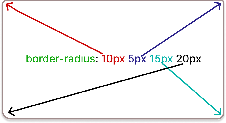
border-radius: 10px 5px 15px 20px;
border: 2px solid red;
width: 200px;
height: 100px;
}
In this case, all <div> elements will have different border radius for each corner, with the top-left corner having a radius of 10 pixels, the top-right corner 5 pixels, the bottom-right corner 15 pixels, and the bottom-left corner 20 pixels.
To create a perfect circle, you can set the border-radius property to 50% of the element's width or height:
Example
            div {
   width: 100px;
   height: 100px;
   border: 2px solid red;
   border-radius: 50%;
}
In this example, all <div> elements with the class "circle" will become perfect circles due to the equal border-radius value of 50%.